Pages

Friday 30 September 2011

Google Analytics Adds Real-Time Traffic Data

Google for the first time is providing a window into real-time web traffic with Google Analytics Real-Time.

Real-Time reports are available in the new version of Google Analytics, and administrators with Analytics accounts will get Real-Time reports. Google turned the new feature on Thursday for “a number of you,” John Jersin, product manager at Google Analytics wrote on the Google Analytics blog.

For users trying to gauge how a campaign or post is performing, Real-Time will track the immediate impact to site traffic. If a user posts something and then tweets about it, for instance, Real-Time will track when traffic from the tweet stops driving visits.

Google isn’t the first company to offer such data. Woopra, Chartbeat and a number of other tools also provide data in real time. But unlike some of those, Google’s will be free.

Speaking of which, Google also rolled out Google Analytics Premium, the first paid Google Analytics product. Perks for the service include extra processing power, advanced analysis and 24/7 support for $150,000 a year.

image


image

Thursday 29 September 2011

25+ free unique business card PSDs

1.

image

This is one business card with four different color schemes. This one is very unique because including a texture in print work can be hard to pull off, but this template did a great job. The design is extremely clean and can work for almost any type of company.

2.

image

This one has a minimalist yet friendly design that I really enjoy. Quite frankly, some folks either overdo or under-do the minimalist business card, but I think this card gets it right—especially for free. It’s illustrative and great for creatives and crafty businesses. Another great thing is that you can choose between three different reverse sides.

3.

image

In this template pack, each card commits to a very attractive color. It’s very bold and pretty much demands attention. If you were to use this template, you’d have to get with your printer and pick out some really great paper to go with this and put some style on it. I can imagine this using the letter press technique.

4-8.

image

Five great business card designs to choose from that are extremely unique and all designed by me. They don’t have (or necessarily need) a back side, but are definitely different than most things you see passed around. Most of these are illustrative and are great for individuals—they’ve got a little something for every one.

9.

image

This card would be great for a modern tech business or even a printer. The color palette is really pretty and actually brings a sense of elegance even though we are dealing with pretty geometric shapes.

10.

image

Another minimalist card that’s pretty solid. The black and white is classic and great for anyone and anything, and it also means printing this card would be much cheaper than printing a color card. This is a great starter card.

11-20.

image

Here are ten free templates, also designed by me. Most of these designs are very illustrative, yet clean and simple. However, they do not have backsides. This is another well-rounded pack with something for everyone to enjoy.

21-27.

image

This is actually a 7-pack of business cards that use photography on their business cards. I actually love to see pictures on business cards and would love to see more of it. These are a great solid starting point for photographers or folks who want to show off their products.

28.

image

I thought this was pretty unique and screams lawn care services or a ‘green’ product. Conceptually, it’s simple and only has three layers, but I like it and can really see it used with an amazing die cut card.

29.

image

This is a great a template. You can see the detail in it and it’s absolutely perfect to me—I wouldn’t change a thing. Great for some sort of company and ready for print—what more could you ask for?

Google Analytics Finally Goes Real Time (Plus New Premium Accounts)

image

We asked Alistair Croll, co-author of the O'Reilly book Complete Web Monitoring and the co-chair of O'Reilly's Strata conference on data, what he thinks Real Time Google Analytics means and this is what he told us:

Google Analytics has introduced an entire generation of entrepreneurs to Business Intelligence. But it's big and heavy, and until now, reports didn't show you what was happening right now, giving rise to a horde of real-time tools like Getclicky and Mixpanel. Realtime analytics might seem like a "vanity" metric--after all, we care about the number of sales that a campaign generated, which is an aggregate measurement.

But these days, marketing is flat, fast, and adaptive. A mention on Twitter can lead to a flurry of activity, and marketers want to engage with those visitors as the traffic spike is happening. Because Google Analytics is already doing the heavy lifting--visitor segmentation, ad campaign effectiveness, keyword search--it can tie the twitchy right-now realtime stuff to the long-term metrics that businesses care about.

Right Now reports will also make it easier for people to test and tweak their Google Analytics configurations in real time, which has long been a complaint with the system.

This is likely the first of a number of very big changes coming down the pipeline for Google's wildly popular analytics service - but it was also a prerequisite for many of the other things we'll see next.

For example, minutes after we posted this - Google also announced Premium accounts for Enterprise customers. Video below. Whoa. The short version: SLA, increased processing power, customer service, fixed (but undisclosed) fee for customers in United States, Canada, and the UK (ouch, sorry world).

My prediction: Google Analytics is going to become a much bigger part of the company and a much broader offering in the future than it is today. With the recent purchase of startup Postrank, Google will be able to offer real-time social media analytics soon. As the definition of the web expands into and beyond mobile, into and beyond other newly connected devices, the Google Analytics offering will expand allong with the world's understanding of information. It will organize all that information and now it has laid the groundwork do it in real time and for a fee.

Wednesday 28 September 2011

10 Tips for Making Crunchy Creative Web Designs

1. Starting from the Scratch :

image
You might have created a lot of rough designs that you would like to use while starting a great project as this will save a lot of your time. This idea can sound extremely comfortable to most of the designers but if you really want to come up with something exceptionally creative, you need to start from the scratch for instance, you can even start your design from a blank paper. Take a blank canvas and start drawing whatever comes to your mind. Do not bound yourself from anything and just draw freely. This is one of the greatest ways to come up with creative designs. As a designer, you need to give yourself a free hand. Starting off with a blank canvas can actually give you a lot of new and creative ideas whereas making changes in an already half incomplete design might be a little difficult. So, go for a blank canvas and you will be amazed at how creative you can be.

2. Do Not Follow the Typical Design Traditions :

image
If you are designing a website for a large target audience, you might have to follow some rules and regulations. You will have to follow a strict layout mechanism and in such cases, you will be bound to create a design according to the rules and regulations and this can affect your creativity a lot. While designing, you need to think out of the box and for this your clients should give you a free hand to think and then design. If you have to follow any rules and regulations, you should come up with a design first and then you can think how to make it work following the 960 pixel box rule. You can even find new rules to implement your designing, all you need to do is explore and get out of your comfort zone in order to show the best of your creativity.

3. Avoid Using Content Management Systems :

image
Finding tools which can increase your productivity and save your time is always a good thing. Content Management Systems is a great tool to save time and come with a beautiful design. CMS is basically used to save time as it provides an opportunity to make instant changes. Once you present your product to the client, he would require a few changes here and there and CMS can do that quickly and easily. But such softwares will always come with a few restrictions so if you can let go, just let it go in order to see the level of your creativity. Designers these days confine themselves from so many things that showing the best side of their creativity get impossible.

4. Online Templates/Inspirations should Be a Big NO :

image
Before starting a project, you should never look for an inspiration or view other designs from big designers. If you are doing anything like this, you are not beginning your project with your own creativity.  When you are free, there is nothing wrong in visiting such websites because seeing work of other people will always encourage to you improve. Some clients will even provide you with inspirational links in order to explain to you what they really want. The key behind coming up with a unique design is that when you are about to start a project; do not visit these inspirational website and come with something of your own.

5. Always Try Something New :

image
Creative people should always be trying something new. Following the same path as you have used before to get a project complete might be a great idea because you know it works for you and it will save your time as well. Following the same path every time can get really monotonous so you need to keep the creativity going by trying something new every now and then.

6. Ignorance is a Bliss when it comes to coding :

image
As a web designer, you should know coding as well. But, knowing coding means restricting yourself from a lot of things. If you will design and code too for the website, you will end up removing a lot of things from the layout just because there were some issues with the coding. If you really want to come up with something creative, ignore that fact that you know HTML, CSS or JavaScript.

7. Old is Gold :

image
Designers these days think that using a table while designing is indeed a bad idea. However, I think that they still hold an importance in a web designer’s life. You do not have to come up with a layout using table but you should not ignore its importance completely.

8. Learn New and Improved Things :

image
Your designing would also include browser testing and a lot of other stuff. If there are new things in the market related to web designing, you must learn them. As mentioned earlier, there is always a room for improvement and in the world of web designing and developing, things are constantly changing so you can learn and experiment something new with e very project.

9. Do Have Limitations :

image
I know, I have said earlier that you can come up with a design if you allow yourself to think freely.  However, if you are struggling with this, you can constraint yourself but be unique in constraining yourself too. You can limit yourself from a few things that you have always been doing and try something absolutely new.

10. Work With Partners :

image
Partnering up with other people can be fun and frustrating both. However, it is indeed a great way to learn to be patient and also to learn new things. You will have your differences but more creative people can surely come up with something brilliant. Also, it can be very challenging for a creative person to work with other creative people.
Sponsor :
----------------------------------------------------------------

Mr Web Design
Web Design Company 3992 0056 專業網站設計

Web Design Comapny

Monday 19 September 2011

Top 5 Way Optimize Your Facebook Page

re you maximizing the marketing power of your Facebook page?  Want to know how?

Keep reading…

There are several lesser-realized features on and around your Facebook page that can be optimized to best reflect your brand.

Let’s break down your page visually into 5 major parts to understand best how to optimize your Facebook page:

wildfire

The tips below will encompass advice about how to optimize areas #1-5 shown above, including taking a look at the featured photos, left-side links panel, impressions and feedback on the wall, featured likes, and wall tab display.

#1: Featured Photos

Any photo you upload to your page automatically flies up to the featured photo feed, a row of 5 photos that will change position every time a visitor lands on the page. We’ve seen examples of some brands getting creative with this panel and using it for branding. But because you have to account for the pictures changing order each time the profile is refreshed, you might need to come up with branding imagery that remains consistent no matter what order it’s viewed in.

Because any pictures you upload automatically go into the strip, including wall photos that you upload as part of a status update, the only way to remove photos is to manually delete them from the strip as you see them appear. This will not remove them from your albums, only from the top of your profile. User-uploaded photos will not go into the strip.

It’s worthwhile to consider how you want the strip to appear to your visitors. A collection of random photos of people in the distance may not grab visitors’ attention. Optimizing the photos in the strip and selecting only closeup shots of your employees or your products may give you a new opportunity to engage visiting users.

Let’s look at some examples of interesting uses of the photo strip by brands:

hanes

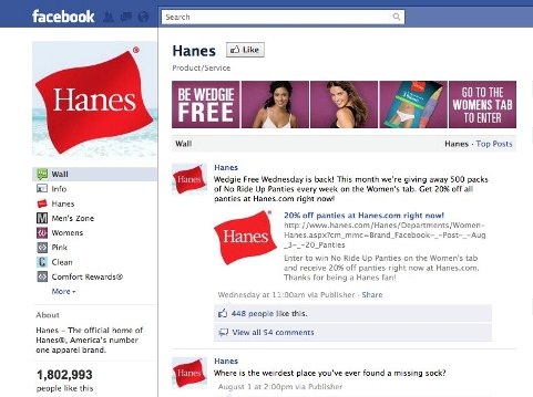
Hanes uses their photo strip as advertising space to promote a giveaway on their page. This serves to grab attention of users visiting the wall and works any way the pictures get ordered. It also promotes further activity within the Hanes page—telling users to click on another tab on that page in order to participate.

steve madden

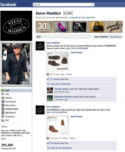
Steve Madden's fan page also gives special treatment to the 5-photo strip. Here, the photos are used to depict new items from that season's collection, as well as a 30% off sale that's happening. Again, it's worthwhile to note that no matter in which order the pictures appear, the message in the strip remains clear.

#2: The Left-Side Links Panel

All Facebook pages have a panel of links on the left-side navigation which, when clicked, open the application in tab view, right in the fan page.

Every fan page comes with 3 default applications native to the Facebook platform: Wall, Info, and Photos. Of those 3, only Photos is removable—Wall and Info are mandatory to maintain a page.

You can install as many other applications to your page as you want, of course. Most will either be third-party applications like promotions or applications you create yourself using iFrames.

It’s important to note that there is a concept of above or below the fold within the links panel: only 8 links are visible to visitors at first. To see more, users need to click “More,” and that’s something we can’t always count on people to do. For this reason, you want to make sure you’re displaying the most important tabs above the fold, in the top 8 links.

Below is an example of a page, for the North Face, where some of the most interesting tabs are hidden below the fold, a result of which may be that scores of users might not stick around long enough to find and engage with them:

the north face

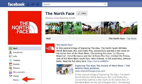
This is the North Face page for all new visitors. The first 8 left-panel links are displayed, along with the "More" function to display the rest.

the north face

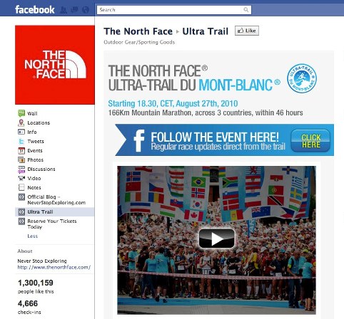
On expansion of the links panel, we can see that North Face actually has 3 additional custom applications hidden below the fold.

When the “More” button is clicked on the North Face page, 3 additional tabs are revealed, all of which are custom-created, including the one pictured above. This tab contains a well-designed interactive page with video.

While there have not yet been studies conducted to see how many users click “More” when viewing rows of links in a panel, we can assume there would be significant dropoff, leading this page to have lowered exposure, and become a marketing effort lost on many users who never see it.

The good news is that it’s very easy to change the order of how the links appear in the panel. When you’re logged in as administrator of the page, you’ll see an option to “Edit” right underneath the links. Once you click, you’ll notice that the editable links gray out and can be dragged up and down to change their placement, or deleted outright from the panel.

#3: Rolling Feedback

When you’re logged in as an administrator of your page(s), Facebook displays handy rolling feedback with every post you make. This makes it very easy to see trends of interaction on your page by content type, time of day or frequency. This also makes it easier for you to assess how you’re doing over time (rather than analyzing these particular traits inside “Insights,” which doesn’t show what type of message it was, like a post with a photo, or a post containing a hyperlink).

The numbers won’t show for approximately 12 hours after you post, as the EdgeRank algorithm is still working to determine how much reach your post will get. Once a baseline reach has been determined, according to the initial hours of popularity your post has garnered, the numbers will show up and can change over time as more (or fewer) people interact with your page.

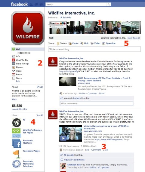
Let’s assess some trends I can learn about the fan page I administer for Wildfire Interactive in the screenshots below:

wildfire engagement

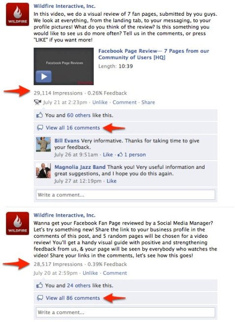
Two trends I can assess for this audience are 1) certain types of posts I make inspire many more likes than comments, and 2) other types inspire more comments than likes.

In the screenshot above, both posts, which were made one day apart, are successful by the standard of feedback I have gauged over time for this page. But now I know that when I invite my audience to share and publicize information about their own businesses, they like to do it and will leave this information in the comments. However, fewer of them choose to leave opinions about the video produced by the fan page using comments, instead preferring to express a like, which requires less work.

In both instances, the reach was very similar, but the opportunity to publicize their own fan pages inspired markedly higher interaction and feedback from fans, whereas just asking for their opinion achieved more clicking Like with less commentary.

#4: Featured Likes

Under the left-hand links panel, there is a group of 5 Featured Likes, which will display up to 5 other brand pages you have liked while logged in “as page.”

Along with the latest brand page redesign in February, Facebook introduced new login options which allow users to browse Facebook as their personal account or as a page (that they administer). The distinction is that when you leave comments and like things, you’re either tying that activity to coming from your personal profile or your professional brand profile. In this way, brands can like pages and leave comments as the brand itself, without bringing the person behind the brand into the mix.

Now that you have the opportunity to express the voice of your brand in this way, consider how you could add to the reflection of your brand by choosing which 5 featured pages your brand likes. While the Featured Likes default to cycling randomly through all the pages your brand has liked on each page refresh, you can also set the 5 “featured” pages in your settings so that they don’t rotate.

Here are some examples of pages that relay different messages with their Featured Likes pages:

tide

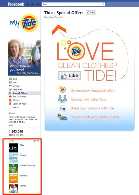
The Tide fan page takes advantage of the "Featured Likes" section to demonstrate the brand's affinity for other Proctor and Gamble (P&G) product pages.

verragio

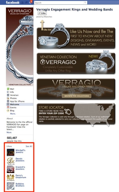
The Verragio fan page uses the Featured Likes section of the page to display the fan pages of jewelry shops and brands that carry the Verragio brand in their stores.

To set your 5 pages so that they don’t change or rotate when your brand’s page is refreshed or revisited, you’ll need to select the featured pages within your page settings, as pictured in the screenshot below:

featured likes

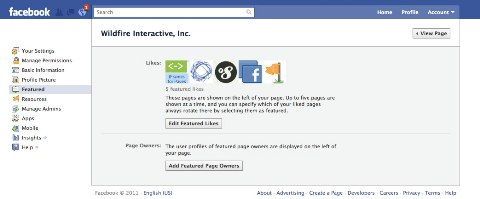
Set your page Featured Likes by changing the settings in "Featured" when editing the fan page.

#5: Wall Tab Layouts Can Be Different

Facebook allows page administrators to choose the default wall layout for visitors, between the chronological “Most Recent” and just posts made by the page, “Page.”

If the selection is chronological, users landing on the wall will see every interaction made on the page, including page posts intermingled with fan posts.

Many businesses choose not to use this view as the default, especially larger brands, because a lot of what random fans post can be spam or otherwise irrelevant content that quickly clogs the wall.

By choosing to display posts made by the “Page” as the default, posts made by your fans don’t go away—they can be accessed by clicking into the “Most Recent” feed. In fact, it is still highly recommended to stay on top of this feed, because as the admin you’ll want to moderate and respond to what fans are trying to communicate to you by posting on that part of your page.

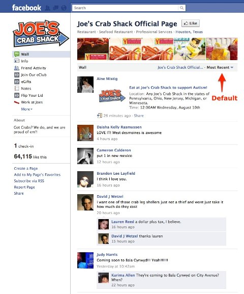
In the example screenshots below, you can see that Joe’s Crab Shack, which has the Chronological view set as the default, has a mixed bag of commentary from fans straight on the wall, which isn’t the most engaging marketing messaging for new and returning visitors to come across at first sight.

joes crab shack

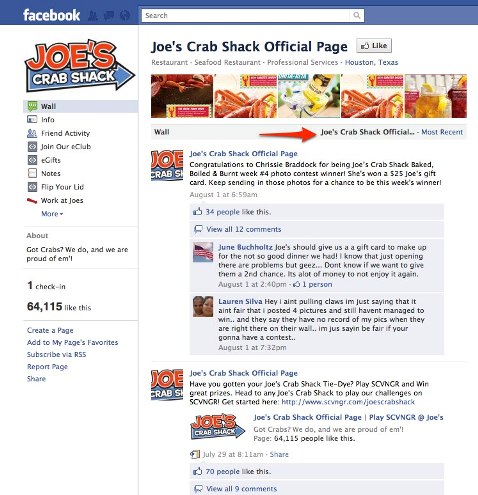
If, instead, Joe’s Crab Shack changed the default wall view to “Joe’s Crab Shack Official Posts,” the feed viewed by visitors to the wall would, by default, be the one created by Joe’s itself—with catered marketing messages and pointed status updates, encouraging fans to visit and interact, as seen below:

joes crab shack

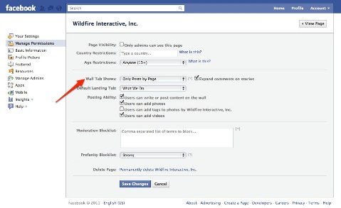
To control which posts show on the wall tab, edit the settings of your page as pictured below:

edit profile

Now you’re armed with 5 ways you can optimize your fan page using available Facebook functions.

What do you think? What’s the first change you’re planning to make? Share with us in the comments section below. Maybe you have some tips for improvement the entire community can appreciate!